Amalyet componets library

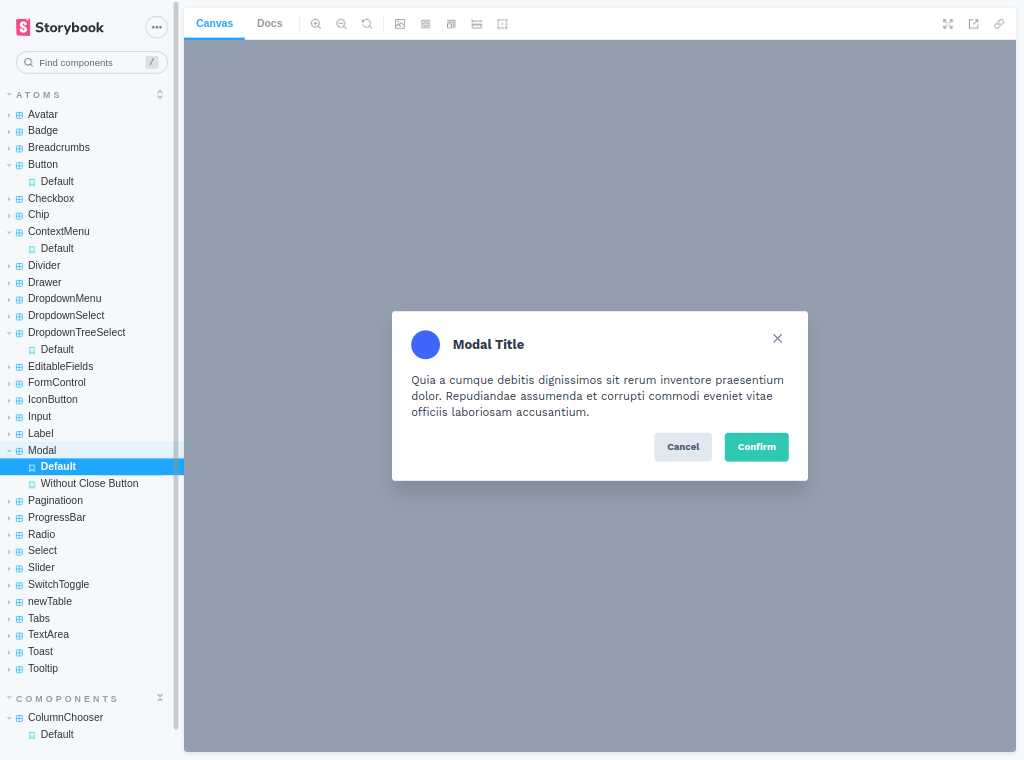
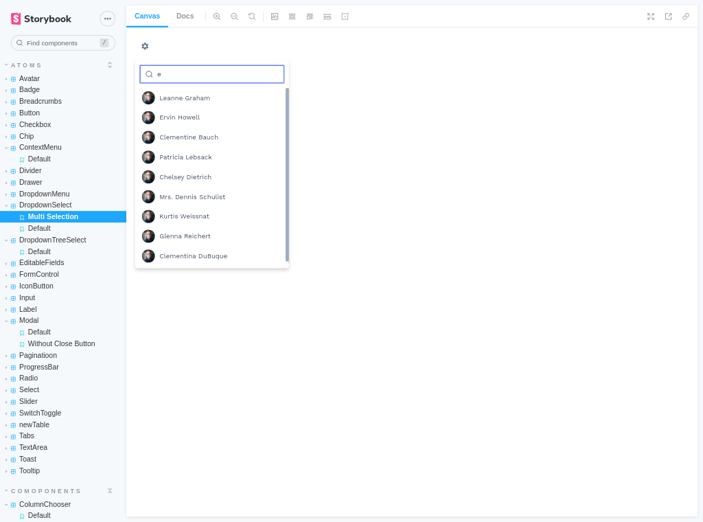

The Amalyet components library is a comprehensive design system built using modern technologies like React, Styled-components, and Storybook. The goal of this library is to provide a unified design language and a set of reusable components to be used across different projects within the Amalyet organization. The library includes a range of essential components such as modals, tooltips, forms, tables, select boxes, and tree select boxes, among others.
The Amalyet design system provides a consistent look and feel for all of the components, making it easier for developers to create high-quality user interfaces that align with the organization's design standards. The use of React and Styled-components makes it possible to create dynamic and flexible components that can be easily customized to meet the specific needs of each project.
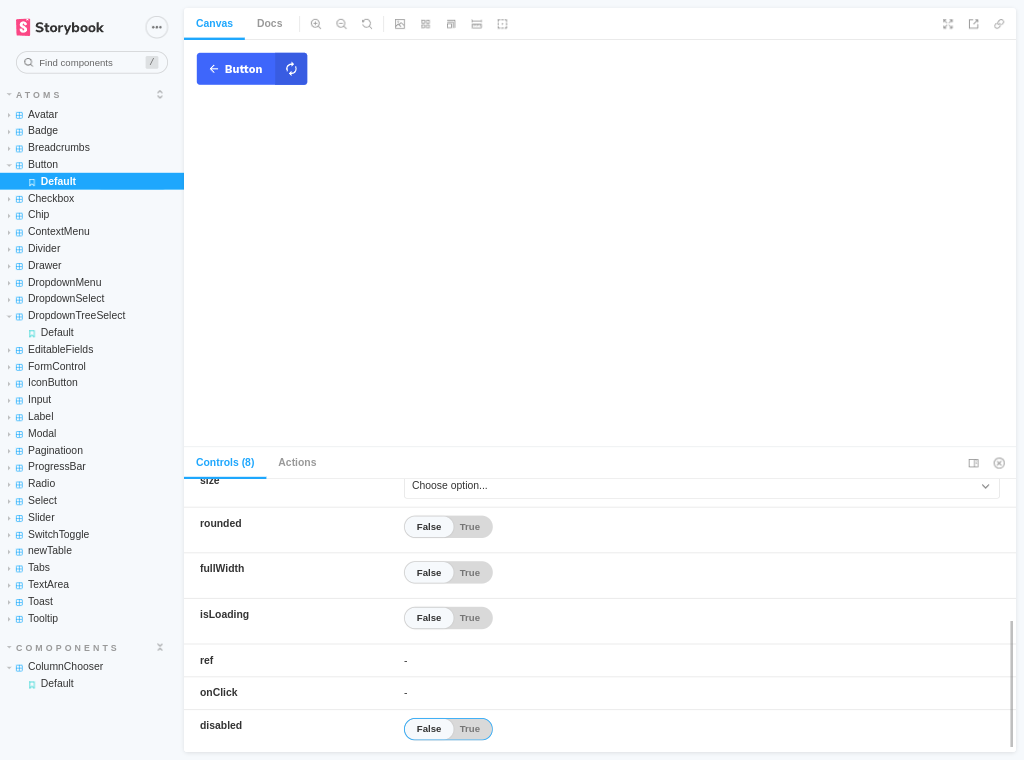
Storybook is an open-source tool used for developing and testing UI components, and it provides a visual representation of all of the components within the library. This allows developers to quickly view and test the different components, making it easier to identify any potential issues and make any necessary changes.
The Amalyet components library is shared internally within the organization, providing a centralized location for all of the components to be used across different projects. For example, the Amaleyt dashboard and the Documents app are two projects that use components from the library, which ensures a consistent user experience and helps to reduce the amount of time and effort required to develop new features.
You can check out the Amalyet app in action here.
In summary, the Amalyet components library is an essential tool for the organization i was working for, providing a unified design language and a set of reusable components that make it easier for developers to create high-quality user interfaces that align with the organization's design standards.